Tuesday, 31 January 2012
Comments
Claire has said to do more mark making which I haven't done much of yet, so I'm going to get a few more artists and start to do more mark making and get some shapes which I find really inspiring and start to try to fit the themes together a little bit better than I previously have been.
Photoshop...
 |
| Final Print |
 |
| Original Drawing |
 |
| Picture 2 |
 |
| Picture 3 |
 |
| The complete block. |
We opened the drawing jpeg in Photoshop and then clicked the padlock to change the background to a layer. To tidy up the drawing we turned the snap tool up and then cropped the edges off as they were untidy.
We then zoomed in so that we could smudge any remaining parts into the corners so we had a complete picture.
We then changed the size of the canvas to 480 x750 and moved the picture down to the bottom and added 1500 to the height in pixels so there was extra space at the top and then dragged the picture while holding alt so that it would make a copy and drag it up into the space above and then flipped it vertically so that it matched up. (picture 2) Then we edited and flipped the top one vertically so that they lined up (picture3) and then changed the canvas size so it's double the width and defined it as a pattern. We then got a new file and made it 300x300 and changed the resolution to 72 and used the pattern paint tool to repeat it several times.
This will benefit me as I will be able to make my own print patterns so that my work can be more unified and unique while still be exciting. It will also help me to be able to do other things on Photoshop now that I know more simple steps, such as how to easily replicate something, change the size, merge layers etc.
Sunday, 29 January 2012
The British Museum


I then went to "Browns Focus" so that I could do some research on Pierre Hardy and find out who he was sold along side? Which is Opening Ceremony and to who the customers might be, which are the younger customers and people who like more "alternative" fashion. These customers also want the products that come from designers who's work instantly turns into "must-have items"and are forward-thinking in fashion.
Saturday, 28 January 2012
Pierre Hardy

In 1999 Pierre Hardy created his own brand and launched his first womens shoe summer collection. He opened his first boutique in paris in 2003 and opened a store in NY in 2010. The brand now has mens and womens shoes as well as accessories.
His work is quirky, eccentric, at the same time, futuristic, bold and yet with referenced.


Photoshop- Creating patterns

We used 2 pictures (above) to start with and opened the water colour document to start so it was the base. We then clicked the padlock so that the background was unlocked and became a layer and then opened the butterfly jpeg and dragged it onto the watercolour page. We then aligned the butterfly, then clicked the ruler’s option and put both guides at 400 so it was central. We then created another layer of the butterfly which was a copy, and then clicked the eye on original butterfly so we couldn't see it. We then went to the view tab and turned the snap tool on and used the rectangular marquee tool around a quarter of the butterfly then cut out with command + x then pasted it back onto the board and moved it to the bottom left corner. This was so that when the pattern is repeated a complete butterfly is formed. We then cut out the left side and moved it to the left side and clicked the eye on the original pattern. When we have finished you get a piece with a butterfly in the middle and a ¼ of one on each corner. We then defined the pattern, created a new document that was 200cm by 300cm and used the bucket tool to paint in our pattern. We can change the pattern by using the offset tool and moving it to make the pattern slightly different.

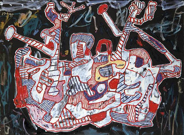
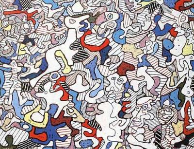
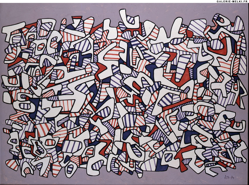
Jean Dubuffet + Olympia example
French avant-garde painter, born in Le Havre (1901-1985).His paintings have developed a distinctive style of simple, primitive images in a heavily encrusted canvas.This style helped Dubuffet gain a worldwide reputation. Fascinated by the art of children and the insane, for which he coined the term art brut ("raw art"), he emulated its crude, violent energy in his own work. Critics soon applied the term art brut to Dubuffet's paintings, rather than to their stylistic source as he had intended. This artist relates to Pierre Hardy because of his use of shapes and lines. It also relates to the Olympia theme as I intend to laser cut out the pizzle pieces but for some of the pieces to be shaped in Olympia style shapes


Comment Reflection
I showed Kat my book and she has said that I should try to draw shoes and flowers from different angles i.e. upside down, hung from something and to try to draw using the surrounding space instead of the outline of the shoe, and to make shapes out of the surrounding space left outside the shoe as it can be more experimental.I also drew a few leaves and she said that I should try instead of drawing the outline of the leaf to instead draw the skeleton of the leaf and not the outline. She also said for me to do more drawings of the things that I liked and to fill in the few gaps that I had. I have therefore found some images to draw from so that I can fill in the gaps coherently and have found more leaves from which to draw. I am also going to draw all of my shoes from different angles and take photo's as well and will try to draw some flowers upside down as well so that I get different angles as I think this will be more interesting than the normal side view of a flower or shoe. I am also going to try to use the whitespace that is left over as the shape of the shoe/flower and to make a pattern from it.
Thursday, 26 January 2012
Laser Cutting Induction

Tuesday, 24 January 2012
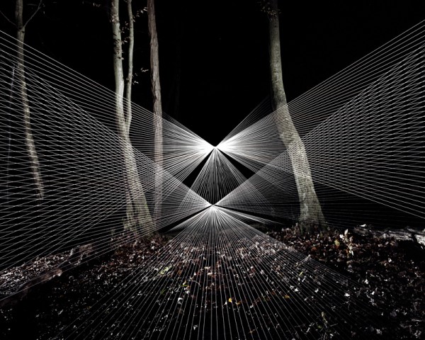
Sebastien Preschoux
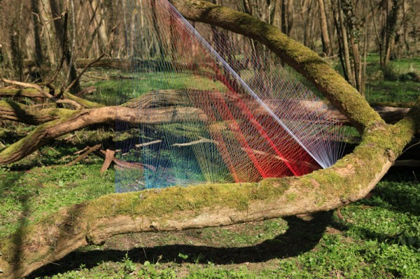
Sebastien Preshoux bases his work on spirographs, thread tensions and also using acrylic paints. His work reminds me of Pierre Hardy beause of the strong lines and colours that are used and the geometric shapes that have been created. This has inspired me in my work because of the interesting shapes that are created by the use of thread to make strong lines and colours.


Andy Gilmore
Andy Gilmore's work is full of color and geometric composition. Andy Gilmore's work is often characterized as kaleidoscopic and hypnotic. This relates to Pierre Hardy as he often uses geometric designs to inspire his collections and always has plenty of colour in his collection. This has inspired my work as it has the Acid colours in that my trend from WGSN has in (Wonderlab Trend) and also has strong lines which I can reflect in my work which Pierre Hardy also uses.


Monday, 23 January 2012
Comment Review
Again I showed my book and it is still not quite as organised as it needs to be. I was advised to look more carefully and make sure that work relates, and to rather leave a gap than to try and make sure pages are full, as I sometimes put things together which don't really match up. I also need to annotate my book a lot more since I can easily explain my book and idea's however my book doesn't relate to what I am trying to say. My pages need to also look more beautiful. It was pointed out however that it was good that I had picked up on artists which is something my designer, Pierre Hardy bases his work on.
In order to make my book better I have started to find out P. Hardy's S/S collections and to group them as so and have started new cover pages to showcase his work since the previous one was difficult to work with and have also started to write out annotations and am adding in pages to make my work more cohesive and less jumpy so that others can see why and how I have gotten things in my book, such as other artists which might inspire P. Hardy. I have also re-done my Trends page so that the colour trend and main trend relate, instead of having colour trend and material trend which didn't really relate in colour or theme. I think this was a good thing to do as I want a 2.1 and feel that by taking on board the advice and by making notes that I can later go back and change things which is also starting to help me to move forward further since I can now see information more clearly and am beginning to be more inspired by the unit which I was previously struggling with.
In order to make my book better I have started to find out P. Hardy's S/S collections and to group them as so and have started new cover pages to showcase his work since the previous one was difficult to work with and have also started to write out annotations and am adding in pages to make my work more cohesive and less jumpy so that others can see why and how I have gotten things in my book, such as other artists which might inspire P. Hardy. I have also re-done my Trends page so that the colour trend and main trend relate, instead of having colour trend and material trend which didn't really relate in colour or theme. I think this was a good thing to do as I want a 2.1 and feel that by taking on board the advice and by making notes that I can later go back and change things which is also starting to help me to move forward further since I can now see information more clearly and am beginning to be more inspired by the unit which I was previously struggling with.
Tuesday, 17 January 2012
Photoshop...
 |
| Original Version |
This will help me as when I do a picture on photoshop I can make it look more realistic by knowing how to use reflections and can also make objects look more 3D by using the perception tool which will make my photo's look more realistic.
 |
| Original Set of bottles, worked from. |
 |
| Originial Box worked from |
Subscribe to:
Posts (Atom)